A Mobile-friendly & Lightweight Date/Time Picker for Divi.
The quick version of how it works
To add a date or time picker to your contact form module, all you need to do is:
- add a normal Divi Contact Form module to a page.
- add a standard text input field to the form.
- Activate the date/time picker toggle.

Date Picker Features
Min/Max date
(Select a hard date or rolling dates that update automatically.)
Disable specific days of the week
Disable specific dates
Select date range
Select multiple, non-consecutive dates
Date format options
Set language and localization on a per-picker basis
Completely customize the appearance to match any theme
Time Picker Features
Set Min/Time time
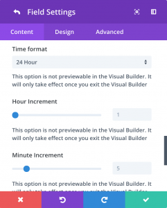
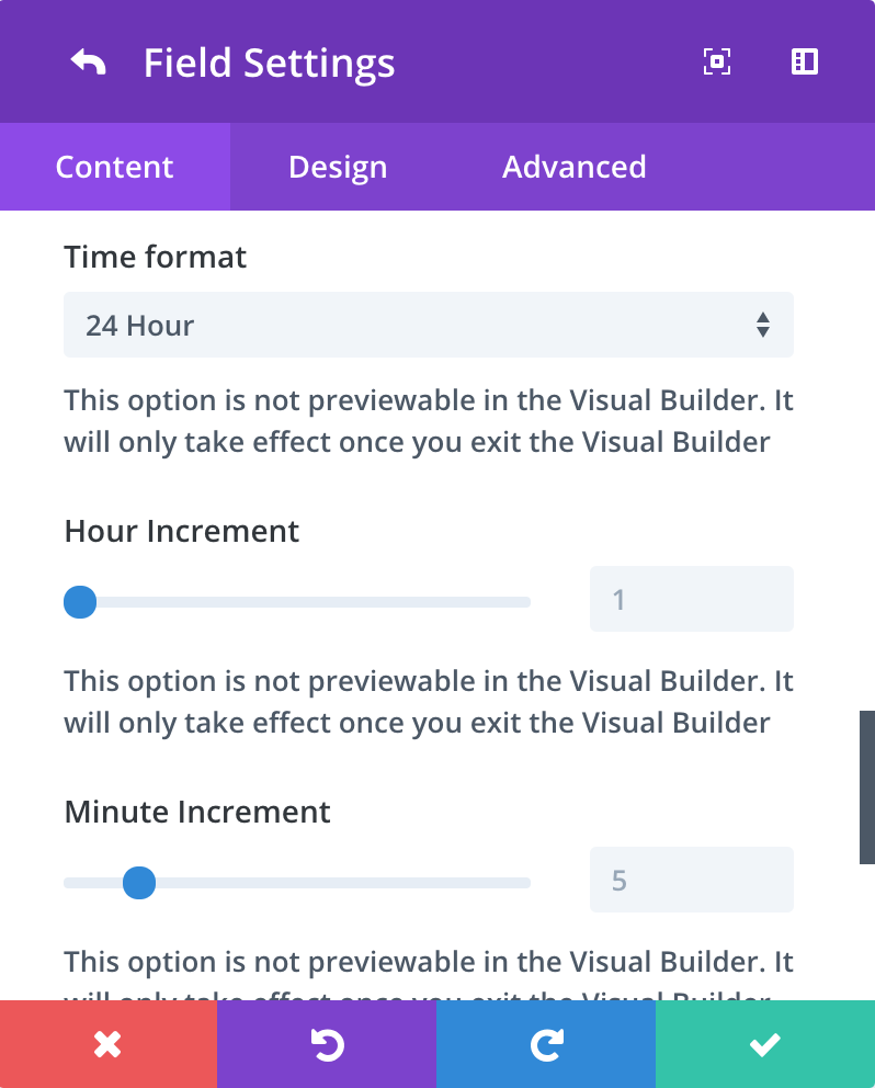
12 hour/ 24 hour format
Adjust hour increment
Adjust minute increment
Completely customize the appearance to match any theme.
The Date Picker
Basic Date Picker
Add a new field to your contact form and set the field type to input. When the field is set to input, a toggle called Enable Date/Time Picker will be visibile. You can then set the Picker Type to Date.
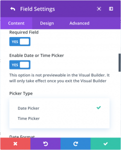
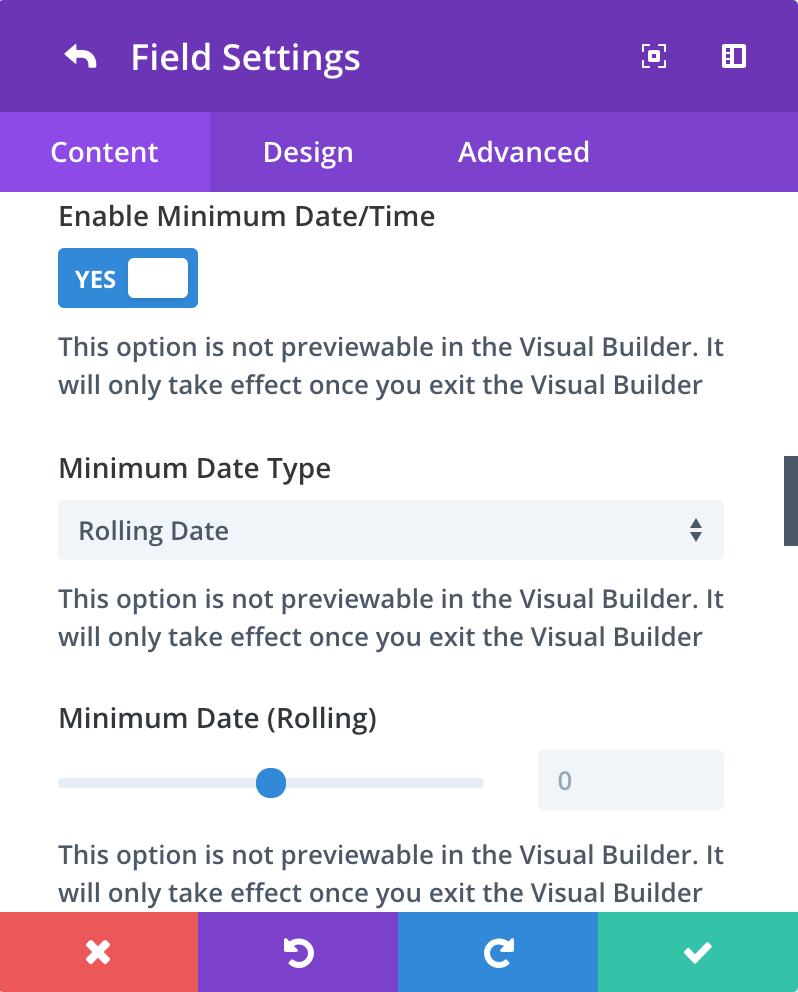
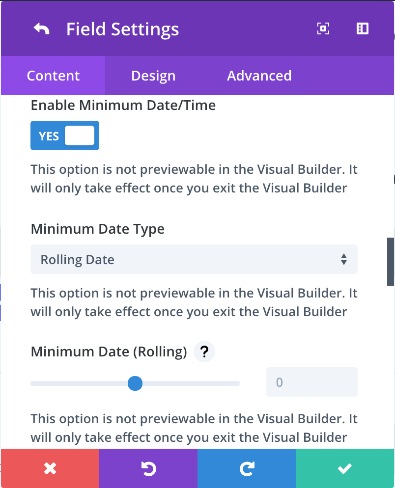
Only allow dates after today
Set Minimum Date Type to Rolling and set Minimum Date Rolling to 0. The number zero (0) always represents the current date so setting it zero (0) will always make the minimum date the current date.

Minimum Date (Hard)
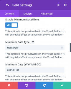
Once you’ve toggled Enable Minimum Date/Time to On, set Minimum Date Type to Hard. You can then enter a single date in the Minimum Date field. The date must be entered in YYYY-MM-DD format.
The example field above has a hard minimum date of August 15th, 2021 (2021-08-15).
Minimum Date (Rolling)
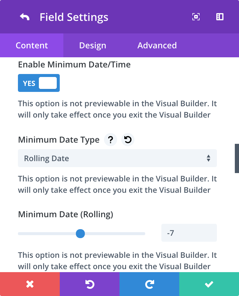
Once you’ve toggled Enable Minimum Date/Time to On, set Minimum Date Type to Rolling. You can then use the range slider to set the number of days before the current date (negative integers) or after the current date (positive integers) that should be used for the minimum date.
The example field above has a rolling minimum date of seven days BEFORE the current date (set to -7) .

Maximum Date (Hard)
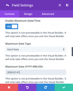
Once you’ve toggled Enable Maximum Date/Time to On, set Maximum Date Type to Hard. You can then enter a single date in the Maximum Date field. The date must be entered in YYYY-MM-DD format.
The example field above has a hard Maximum date of January 1st, 2022 (2022-01-01).
Maximum Date (Rolling)
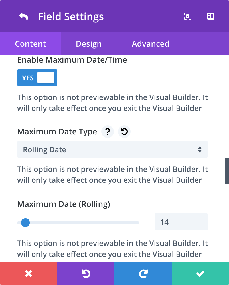
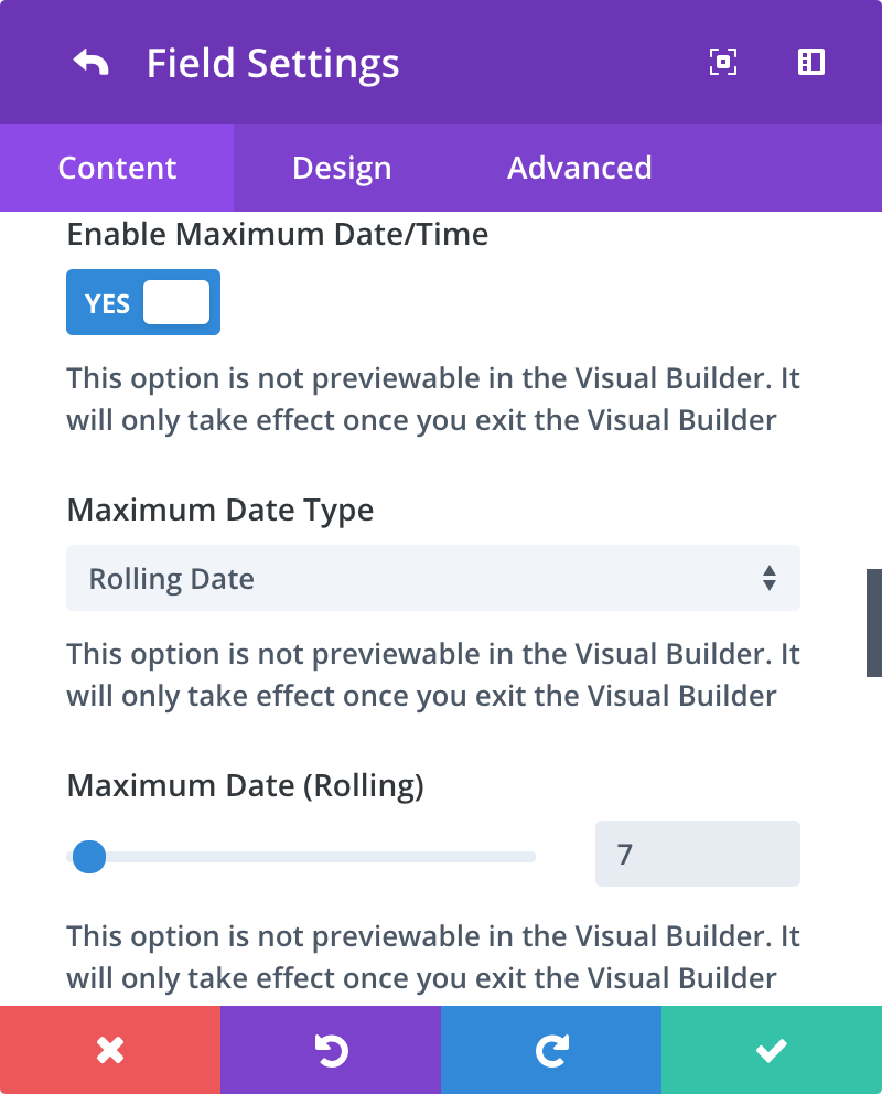
Once you’ve toggled Enable Maximum Date/Time to On, set Maximum Date Type to Rolling. You can then use the range slider to set the number of days before the current date (negative integers) or after the current date (positive integers) that should be used for the maximum date.
The example field above has a rolling maximum date of seven days AFTER the current date (set to 7).

Disable Specific Days of Week
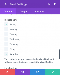
Under the Disable Days option, select the days of the week you’d like to disable in the calendar.
In the above example, Saturdays and Sundays have been disabled in the calendar.
Disable Specific Dates
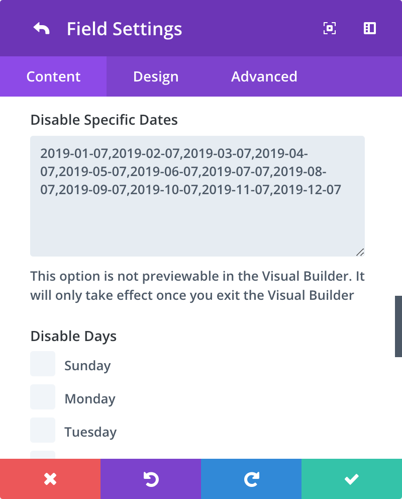
Under Disable Specific Dates, enter a comma-separated list of dates to exclude from the calendar. Dates must be entered in the following format: YYYY-MM-DD.
In the example above, the 7th of every month in 2022 has been disabled.
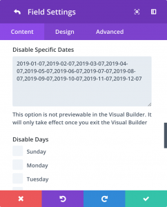
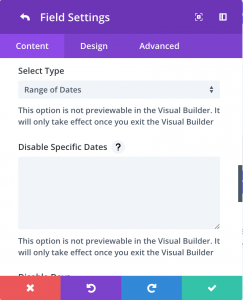
Enable Date Range
In the Select Type dropdown, select Range of Dates from the list of options.
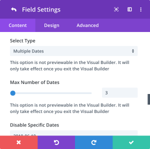
Select Multiple, non-consecutive dates
In the Select Type dropdown, select Multiple from the list of options.
This option also enables the Max Number of Dates field where you can choose how many dates the user is able to select.
The above example lets you select up to 3 dates.
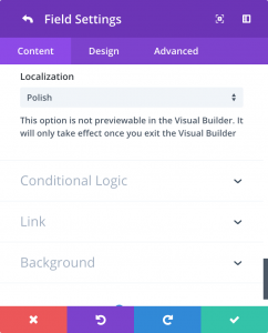
Localization
In the Localization select box, change the option to the desired localization. This will affect the language the calendar is displayed in as well as the organization of the calendar itself.
The above example is set to Polish. Ładny!
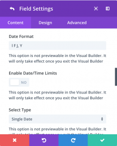
Custom Date Format
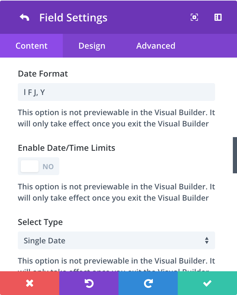
In the Date Format field, use date tokens to change how the date displays in the field when a user selects a date. Compare the date in this field to the date shown other examples on this page.
In the above example, the format is set to l F J, Y
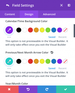
Custom Design
Each instance of a date/time picker can be customized to match your theme or design. User the Design tab, in the Layout toggle you’ll find color options to style the picker.
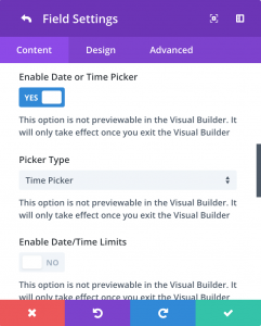
The Time Picker
Basic Time Picker
Add a new field to your contact form and set the field type to input. When the field is set to input, a toggle called Enable Date/Time Picker will be visible. You can then set the Picker Type to Time.
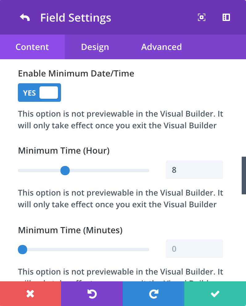
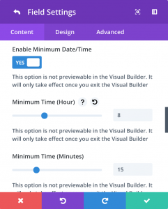
Minimum Time
Once you’ve toggled Enable Minimum Date/Time to On, you can set both the Minimum Hour and Minimum Minutes. The Minimum Hour slider shows 24 hours so 1 PM would be 13, 2 Pm would be 14, etc.
The example field above has a minimum time of 8:15 AM. The hour field is set to 8 and the minute field is set to 15.
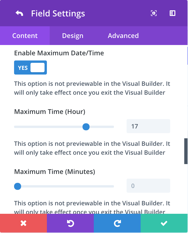
Maximum Time
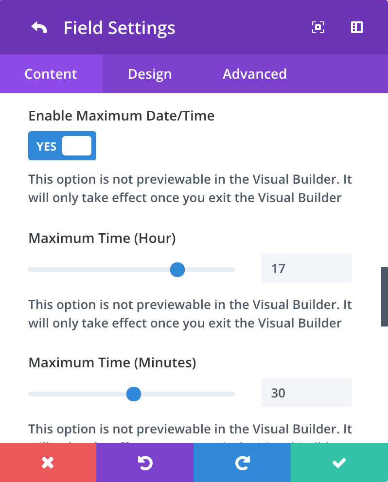
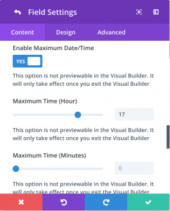
Once you’ve toggled Enable Maximum Date/Time to On, you can set both the Maximum Hour and Maximum Minutes. The Maximum Hour slider shows 24 hours so 1 PM would be 13, 2 Pm would be 14, etc.
The example field above has a maximum time of 5:30 PM. The hour field is set to 17 and the minute field is set to 30.
Combining Features (the fun part)
Date range that only allows users to select dates within the next 2 weeks.
Time picker that only lets you choose times between 8 AM and 5 PM
FAQ
Here are some of the most common questions I receive about the Divi Date Time Picker.
If you don’t see your question here, click here to visit my contact form.
Is there a custom module I need to use?
Can I have more than one datepicker on a page?
Does this impact my GDPR compliance?
IMPORTANT
This plugin is powered by and requires Elegant Theme’s Divi Theme for WordPress, an insanely fast and incredibly intuitive front end editor like nothing you have seen before. It will change the way you build websites forever. (The above link is my affiliate link – if you purchase Divi through that link I may be compensated at no cost to you)

